28 ARTISTS & JOURNALISTS
their work and words, interviews, blogs, images, hints, tips, websites
and more...

Wednesday, January 23, 2013

Fast, or Slow?

I was at our old cabin for the afternoon, and decided to take my time with an ink sketch of the wood stove as it tried to warm the space...

(Yep, this one again!) And of course, I sketched FAST so my breakfast didn't get cold!
Do you feel comfortable taking however much time you need, or have?  In the sketch at top, I had all afternoon, with nothing pressing, so I decided to put my new/old Esterbrook 9128 through its paces.  It was running out of ink, so I got some very fine lines...which I restated when I refilled it.  It was a contemplative exercise and I very much enjoyed it.  Very peaceful!

I chose not to add color to that one--it stands on its own.

Breakfast was a whole other matter!  I didn't want it to get cold, so just did a very simple outline, with that same pen.  THEN I ate, then added color from memory!  I think the color defines and explains the shapes, pulling everything together, don't you?

I teach quick-sketching techniques in my mini-classes (Quick Sketching 1 and 2, and Quick Sketching in Color), and do truly enjoy that discipline for any number of reasons...but there are times when I just want to take as long as it takes.

I took my time here...

And hurried to capture the action here...

What do YOU enjoy most?

Monday, January 21, 2013

Celebrating the Small Stuff...


...like bangers and eggs!  I had to work fast before it got cold, so added the color from memory.

Our trip to the city the other day included a stop by Sheehan's Irish Imports for real Irish sausage, known as bangers.  They're delicious!

Journal Page Tutorial

Last week, we had some unusually warm weather in the lowcountry of South Carolina.  We took advantage by taking our bikes to Pinckney Island National Wildlife Refuge. Our first stop was Nini Chapin Pond. It's roughly two miles from the parking area. There was not much bird activity, but we found some shade and it was a good time to eat our lunch.

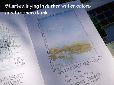
This was the view we looked upon.  There was a small group of Buffleheads feeding in the water.  I loved how their dives caused the olive green water to shimmer with the blue of the sky.

Viewing the scene for a few minutes is a great way to narrow down what really catches my eye, helping me to decide  what to record in the journal.

The next page in my Stillman and Birn journal, that I've devoted to water scenes, was the right side of a spread.  I didn't want to fill the entire page with a sketch so decided upon a smaller vertical image.
Click to enlarge

The first thing I did was to secure a piece of foam core to the right side of the back of the journal.  This made a great surface to hold the palette and less of a balancing act for me.

Next, I drew the vertical shape that would hold the watercolor sketch. Then added pertinent information for the day: date, time, temperature, where we were, and around the edge of the box, I started adding notes about any wildlife that crossed our path.


To me, the lightest color in the scene was the blue of the sky and water.
I knew that if I let most of the paper show through on the lower right corner, I'd stand half a chance at keeping the true color to the foreground grasses.

click to enlarge


Hopefully you can see the first layer of blue!


 Now you can see the first layers of green water and the brown of the far shore's bank.  While painting, the Buffleheads were diving away, always changing what the water looked like.

When painting plein air, light and water are ever changing.  Once I've laid down the initial frame work of colors, I take a good look at the direction of the shadows. I will have to paint from memory in order to make the painting read true. 
All that was left to do was to add notes of any other wildlife that we saw after heading over to the other side of the pond.


Final page, scanned.....


Sunday, January 20, 2013

Referencing all those journals - the lazy way


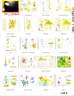
An 8 1/2 x 11 page of thumbnails from one of my journals
I recently had reason to refer to something in an old journal, and it took me only 3 minutes to find it.  Knowing you journallers as I do, you, too have many, many volumes to keep track of.  I know there are people who have the discipline to number pages and create indexes but that's not me, and that's not how I recall information.....I recall events by the pictures I drew of them.  So, upon completing each journal, I photograph the cover and all the pages and print a contact sheet with thumbnails of every page.  I label the pages and pop them into a binder, divided by category (regular journal, garden journal, travel, etc.)  I can flip through those pages and find what I want very quickly!

Letting the journal lead US...


...because really, I've found that the format, style, and even the kind of paper make a huge difference in how I use my journals--at least some of them, and to a certain extent.

I'm playing with lighter, smoother paper in the journal above--Strathmore's multi-media paper I recently bound into a book. It's lighter and smoother than my normal hand-bound journal papers, so not quite as much juicy watercolor work (it does buckle slightly), and more writing--because it's a pleasure to write on!  The pen glides...

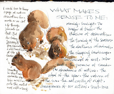
I've found the same thing with my Stillman & Birn Epsilon journals, with very smooth paper--in fact that one has become my must-have daily writing journal, where I might do several pages of written meditations or observations, THEN add a sketch, either related or not.  (I'm looking forward to the upcoming Zeta journal, which will have heavier paper but still this gorgeously smooth stuff!)

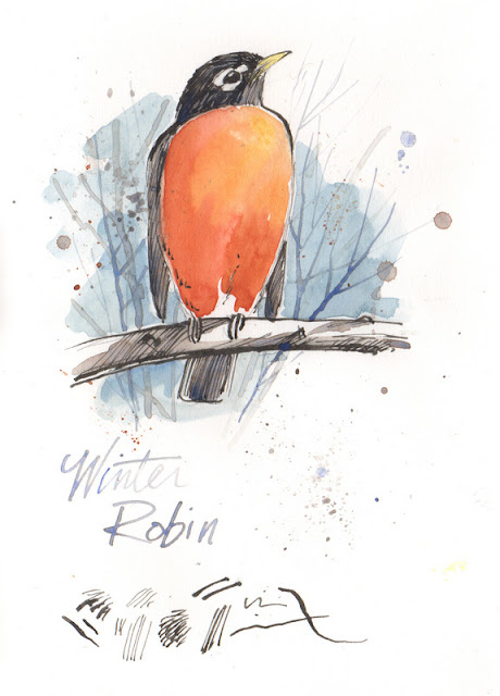
This robin caught my eye as I was journaling...so he ended up in my lovely Epsilon journal.  The pen skates lightly over the paper, and the watercolor goes on crisp and puddly.


I often add toned paper to my handmade journals...so of course I'm moved to add gouache or utilize light and dark colored pencils or inks...
I recently tried out one of Strathmore's toned paper journals, and found it was a real pleasure to work with...smooth for penwork, but still allowing me to add some color and watercolor.  Yum.

This was a quick sketch with ink and colored pencil in the hardbound Strathmore journal.


What's interesting to me is that I've found that ring-bound journals have a sense of impermanence about them.  I am more likely to either doodle, do color or pen tests, or do work I'm willing to tear out for sale.  I NEVER do that with my case-bound books.

Of course many people work only on loose sheets, in an online journal, or even with an app so their work is only on paper if they print it out...

SO--how do YOU feel about paper and format?  Does a ringbound book feel more ephemeral?  Or is it just me...

Thursday, January 17, 2013

Sharing our work online

Photographed, light tweaking

Scanned, no tweaking
Scanned with black paper behind the page, minimal tweaking

This is often a problem for those of us who share our work--how to get a decent image without too much tweaking!  Photographing is often fastest, for me...that's the top image, which would require more tweaking to get rid of the gray/blue cast,  (I did some, but still some tint there...)

The middle image is a straight scan--my paper's rather thin, and the writing on the back side showed right up in the scan, though not in the photo.

And finally, my brilliant husband suggested putting a piece of BLACK paper behind the page--that's what you see in the third scan.  It required only a tiny bit of tweaking, and I'm pretty happy with it!  It's clean and crisp...

I use Photoshop Elements for more serious tweaking, but for sharing online I often use Picasa 3, a free program I downloaded from the net.  It's fast and plenty powerful enough for most uses.  I can resize a bunch of images at once, too...good for those with limited time and not a lot of tech skills!

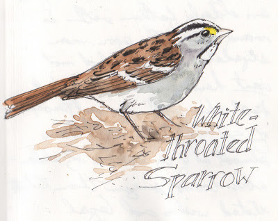
Oh, yes, and this little white-throated sparrow is part of a demo for my upcoming ink & watercolor mini-class!

Sunday, January 6, 2013

Artists' Journal Workshop: My big fat black journal

Thought this might be of interest... again ;D. I posted this in 2011 and it is on the very topic under discussion now. I wanted to repost the whole thing, but I can't figure out how to do that on Blogger!

If you missed it then, here's another look!
Artists' Journal Workshop: My big fat black journal: I’ve long been a fan of the kind of beautiful illustrated journal that Kate Johnson and others, like Roz Stendahl, Pam Johnson Brickell, a...

Friday, January 4, 2013

Journal Pages Don't Have to be Precious!

A page of squiggles--I usually try to make a note of just WHAT I'm testing, because I forget rather too quickly...the guy at the bottom was sketched with my Namiki Falcon, though, I think...

Aquacolor tests...

Playing with paint...

Ink testing in my journal...
People sometimes tell me they're afraid of ruining a journal page...but really, you CAN'T, at least in my opinion, because it's your journal.  It's a learning experience.  Share it or not, it's your choice.

Your journal doesn't have to full of beautifully designed pages, with arrangements worthy of publication and calligraphy worth of Denis Brown.  

It can be a place to play, to explore, to test--materials, techniques, or yourself!  I do a lot of that, testing out a new pen, seeing how transparent my watercolor are...it can be a recognizable image, or just lines and spirals.

I often fill whole pages with tests from various inks or pens...at the top of the page I threw in pencils for good measure.  (And as noted that page would be a LOT more useful if I'd written down what I was using!)

Some of us have a fear of white paper, but I love this E.B.White quote from late in his life: "Even now, this late in the day, a blank sheet of paper holds the greatest excitement there is for me--more promising than a silver cloud, and prettier than a red wagon." 

If the first page of a new journal intimidates you, skip it!  Start working several pages in and come back to it.  Or use that page for a traditional beginning--a favorite quote, a hand-drawn map, a list of intentions or goals, or a sketch of your current watercolor or sketch kit, as Liz Steel and Vicky Williamson often do!

Whatever you do, relax, trust yourself, enjoy your journal, and have fun.
Related Posts Plugin for WordPress, Blogger...